Fertility rate forecast
forecast_fertility_rate.RmdModel structure
The age-specific fertility rate forecast is modeled in four steps:
Cumulate, standardize: The age-specific fertility rate (see input data preparation) is cumulated and standardized to values between 0 and 1. This cumulated and standardized value is called .
Regression: First, is transformed. Then, a fifth-degree regression is fitted to vs. (i.e. age + 0.5). The parameters , …, of the regression are estimated.
Optimization: In this step, the previously calculated MAB forecast is used (MAB prediction for each year in the future). From the regression above, all parameters are kept constant except . For every year in the future, only the value of is changed (only the intercept, all other regression coefficients are kept constant). This is done for every year until the y-values (back transformed to fertility rates) result in the previously calculated MAB forecast.
Reverse: In this step, the TFR forecast calculated earlier is applied. The standardized fertility rate is multiplied by the TFR forecast. As a result you get the future age-specific fertility rates.
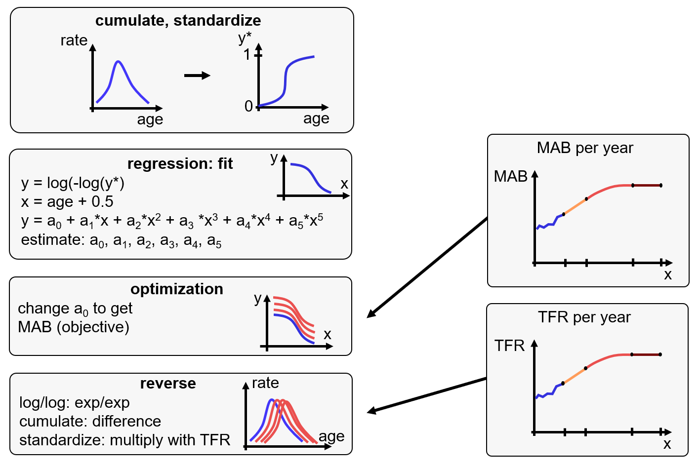
model structure
Code example
Create input data
input <- create_input_data(
  population = fso_pop,
  births = fso_birth |>
    dplyr::filter(spatial_unit %in% c("Aarau", "Frauenfeld", "Stadt Zürich")),
  year_first = 2011,
  year_last = 2023,
  age_fert_min = 15,
  age_fert_max = 49,
  fert_hist_years = 3,
  binational = TRUE
)
TFR forecast
forecast_tfr <- forecast_tfr_mab(
  topic = "tfr",
  topic_data = input$tfr,
  trend_model = c(
    model = "lm", start = 2024, end = 2026, trend_past = 7, trend_prop = 0.5
  ),
  temporal_model = c(
    model = "cubic", start = 2027, end = 2055, trend_prop = 0.8, z0_prop = 0.7,
    z1_prop = 0
  ),
  temporal_end = NA,
  constant_model = c(model = "constant", start = 2056, end = 2075)
)
ggplot(forecast_tfr) +
  geom_line(aes(x = year, y = tfr, color = category)) +
  geom_point(aes(x = year, y = tfr, color = category)) +
  scale_color_manual(values = c("#ffe562", "#A05388", "#ffa81f", "#007AB8")) +
  labs(color = "Model", y = "TFR") +
  facet_wrap(nat ~ spatial_unit) +
  theme_bw()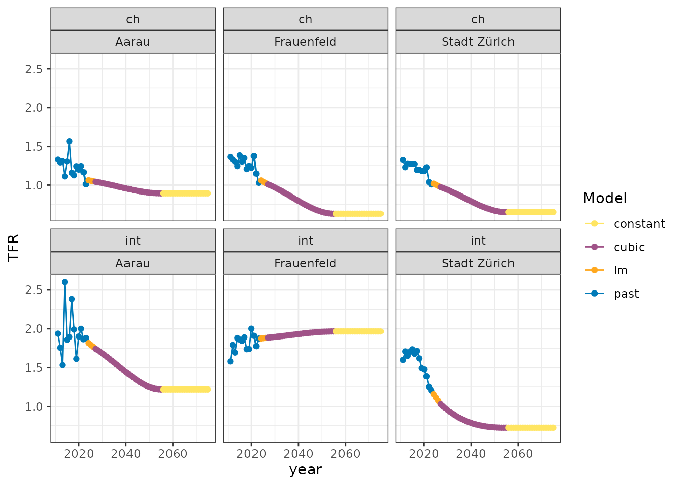
MAB forecast
forecast_mab <- forecast_tfr_mab(
  topic = "mab",
  topic_data = input$mab,
  trend_model = c(
    model = "lm", start = 2024, end = 2026, trend_past = 7, trend_prop = 0.5
  ),
  temporal_model = c(
    model = "Bezier", start = 2027, end = 2055, trend_prop = 0.3, z0_prop = 0.7,
    z1_prop = 0
  ),
  temporal_end = NA,
  constant_model = c(model = "constant", start = 2056, end = 2075)
)
ggplot(forecast_mab) +
  geom_line(aes(x = year, y = mab, color = category)) +
  geom_point(aes(x = year, y = mab, color = category)) +
  scale_color_manual(values = c("#A05388", "#ffe562", "#ffa81f", "#007AB8")) +
  labs(color = "Model", y = "MAB") +
  facet_wrap(nat ~ spatial_unit) +
  theme_bw()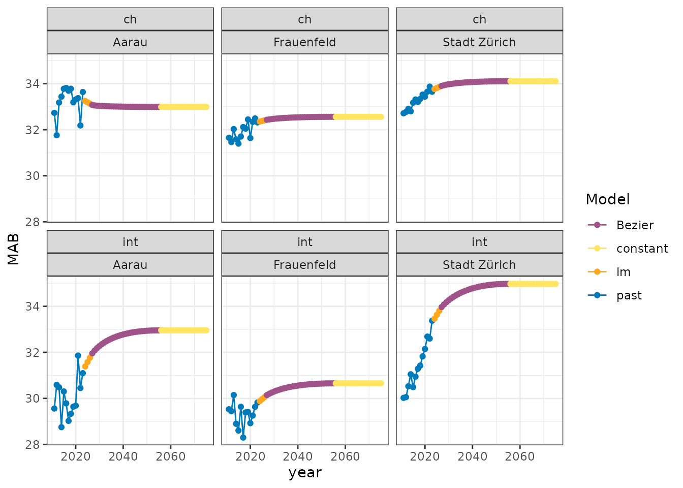
Forecast of the age-specific fertility rate
forecast_fer <- forecast_fertility_rate(
  fer_dat = input$fer,
  tfr_dat = forecast_tfr,
  mab_dat = forecast_mab,
  year_start = 2024,
  year_end = 2075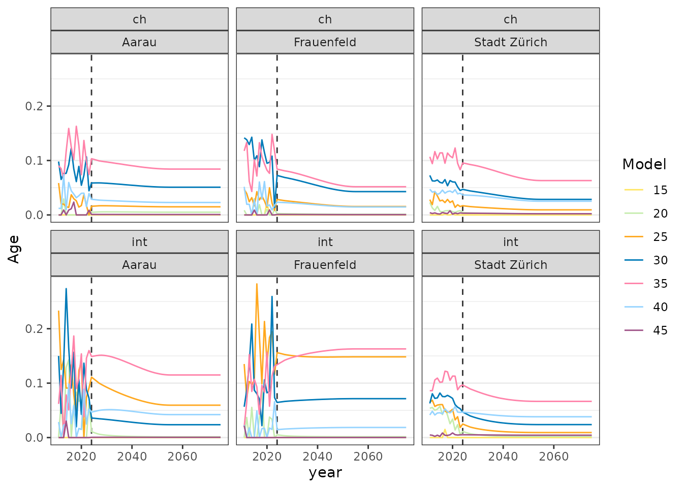
)Plot with year on x-axis
y_last <- max(input[["fer_y"]]$year)

forecast_fer |>
  bind_rows(input$fer_y) |>
  filter(age %% 5 == 0) |>
  mutate(age = factor(age)) |>
  ggplot() +
  geom_vline(xintercept = y_last + 1, linetype = 2, color = "#333333") +
  geom_line(aes(year, birth_rate, color = age), linewidth = 0.5) +
  scale_color_manual(values = c(
    "#ffe562", "#c6ecae", "#ffa81f", "#007AB8", "#FF82a9", "#96D4FF", "#A05388"
  )) +
  labs(color = "Model", y = "Age") +
  facet_wrap(nat ~ spatial_unit) +
  theme_bw() +
  theme(
    panel.grid.major.x = element_blank(),
    panel.grid.minor.x = element_blank()
  )
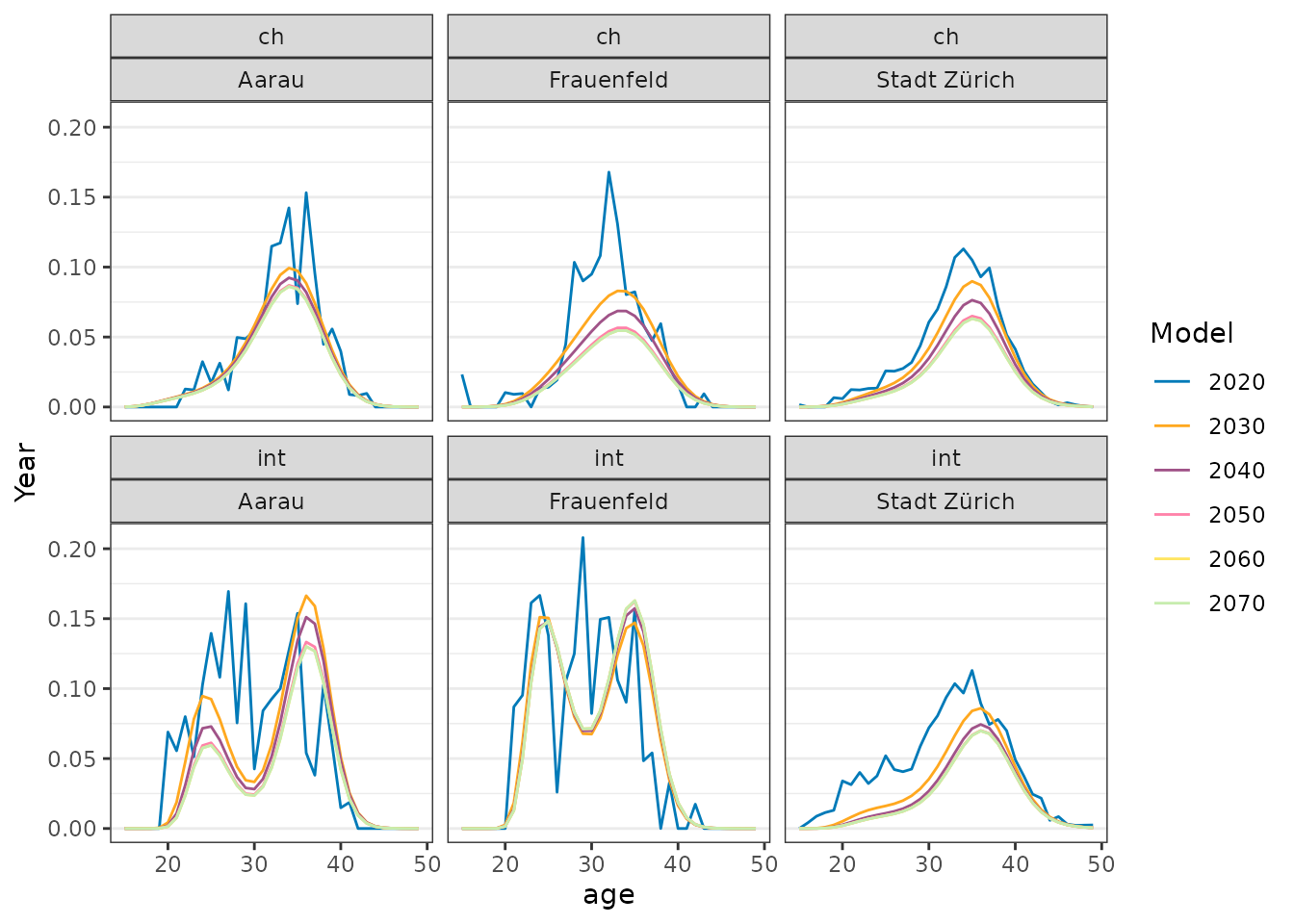
Plot with age on x-axis
forecast_fer |>
  bind_rows(input$fer_y) |>
  filter(year %% 10 == 0) |>
  mutate(year = factor(year)) |>
  ggplot() +
  geom_line(aes(age, birth_rate, color = year), linewidth = 0.5) +
  scale_color_manual(values = c(
     "#007AB8", "#ffa81f", "#A05388", "#FF82a9", "#ffe562", "#c6ecae"
  )) +
  labs(color = "Model", y = "Year") +
  facet_wrap(nat ~ spatial_unit) +
  theme_bw() +
  theme(
    panel.grid.major.x = element_blank(),
    panel.grid.minor.x = element_blank()
  )